
 We love the iconic FLEET logo, and so do our members, who have enjoyed wearing it on hoodies, T-shirts and face stickers, working it into scientific experiments, and outreach apparatus.
What’s the secret of a great logo? For us, it was involving a large team, being clear about what we wanted to do, and why, and iterating back and forward until we found something we loved.
The story of the logo’s development goes back to the Centre’s early years, October 4 2016, when team FLEET started its journey to sculpt the new Centre’s identity—with a goal of being more than just an acronym but a symbol of innovation and progress. In a proposal to the chief investigators, Tich-Lam Nguyen outlined the pathway of brand development:
 Understanding the Why: The journey commenced with a crucial question: Why does FLEET exist? It wasn’t merely about crafting a logo or a catchy tagline but about broadcasting FLEET’s mission and its legacy to the world.
Getting Everyone on Board: True to FLEET’s identity, CIs were rallied together, recognising that a spark of creativity from everyone involved would contribute to FLEET’s brand. Like electrons in a circuit, the team’s collaboration powered the evolution of FLEET’s visual identity.
Crafting the Message: The design brief included FLEET’s vision and mission: to pioneer ultra-low power consumption electronics technologies. It wasn’t just about innovation, but also about collaboration, shaping the future workforce, and fostering gender equity in STEM.
The Quest for Identity: Domains were scouted, and social media handles were secured but the ultimate quest was for the perfect logo that describes what FLEET does and what it means to the team. Inspired by the infinite possibilities of the Penrose triangle and Escher’s mind-bending illusions, FLEET’s branding team consisting of Michael Fuhrer, Meera Parish, Kris Helmerson, Elena Ostrovskaya, Nikhil Medhekar, Matt Davis and Tich-Lam Nguyen embarked on a journey to capture the essence of dissipationless flow and electronics in a single symbol.
The Evolution of FLEET’s Logo:
Like a circuit undergoing iterations, FLEET’s logo evolved through feedback and collaboration. Initial concepts sparked debate, but FLEET’s identity became clearer with each iteration. Each element of the logo, from design to colour and shading, was carefully chosen, from circuit boards to topological shapes, to convey the speed, innovation, and potential of FLEET’s research. FLEET’s logo was unveiled on December 6th, 2016, a testament to the CIs’ collective vision, ideas, and creativity.
Initial ideas from the team worked around these ideas of circuitry and topology…


External expertise was sought, producing design concepts based on the team’s first ideas. Some early concepts helped clarify the team’s thoughts around what they didn’t want, but the process helped hone the FLEET team’s ideas, requesting a second round of design concepts incorporating electronic concepts and circuit-board iconography, a ‘connection’ theme, a topological shape, a ‘fleet’ of electrons moving towards the future. The team asked for a 3D shape, but minimalistic so that it can be memorable.


 Based on this, a refined design was drawn by FLEET Director Michael Fuhrer (in blue, although for the final version we chose ‘circuit board green’), incorporating topology (the Mobius strip), fast-moving electrons, and 2D materials.
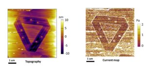
The final victory for the logo has been not being too precious about it. Although we have a branding document that lays out the logo’s colours (#02451c and #0d6b30, if you’re interested), minimum dimensions, fonts, and placement on page and website, we have never enforced this. Thus our members have felt free to animate the electrons, etch nanoscale FLEET logos onto 2D material interfaces, build outreach tools based on the shape, and use the logo’s variable angles to map electrical conductivity under STM. And of course, Jared’s shoes…


More details for anyone kicking off an ARC Centre
On 4 Oct 2016, TLN sent a proposal to CIs to start the brand development process. The proposal included the following materials:
Understand the Why: We want to COMMUNICATE our mission & the legacy we want to create:
- Publicity & visibility
- Increase credibility
- Expand influence
- Build engagement & network
- WHAT do we want to communicate?
- WHO are we communicating to?
- Messages are incorporate in how FLEET LOOKS & SOUNDS
- Everyone communicates the SAME messages – Cohesive & Consistent
How we can start:
- The more INVOLVED we all are, the better!
- EVERYONE needs to be on board with FLEET’s identity & personality.
- The next 2 slides give an example of how the FLEET brand development can begin and how it resonates into visual assets (e.g. website)
Suggested messaging:
FLEET VISION: to develop new systems that lead to ultra-low power consumption electronics technologies
FLEET will:
- INNOVATE to develop the scientific foundation & IP for new electronics technologies
- COLLABORATE with world experts to build capacity for advanced electronics research
- ENGAGE to train the workforce for the electronics industry of the future & inspire future gender-equity generation to pursue education & careers in STEM.
Based on these ideas, we also suggested a sitemap for the website
Asking CIs: What does FLEET means to you in terms of symbol, icon, imagery and associated colour theme. Call for suggestions on what FLEET should look like.
We need to choose domain name that is: meaningful, memorable, easy to type, shot, avoid hyphens and numbers… With some names and links of existing research centres.
Collected quotes from companies that have worked with research centres and universities: Research Media, Bonsai Media, That Marketing Company, Idano Design, and Principals.
Provided a list of possible Centre names and their availability for consideration. CIs voted on their preferred Centre name and FLEET.org or FLEETcentre.org were preferred, but both were unavailable, other options under consideration include CoEFLEET.org and ARCFLEET.org We tried to track the owner of FLEET.org to buy the domain name. In the meantime FLEET.org.au, FLEETcentre.org.au, FLEETcenter.org.au and FLEET.net.au were secured. Work also started to secure possible social media handles for the Centre.
For the logo:
On 7 Oct 2016 MD suggested the “never-ending” concept to represent dissipationless flow such as the Penrose triangle and Escher’s waterfall,
A FLEET branding team was formed for CIs who wanted to be part of the process.
The team started working with Research Media to develop the logo on 20 Oct 2016 and provided a branding brief. Requested: Logo, strap-line, colour palette, fonts, brand guidelines to be developed by mid Nov 2016. The tone of the writing and the imagery; the feelings we are trying to evoke; and the impression we hope to convey through our branding: Advanced, dynamic, technological, green, light, energy, motion without resistance, research, transformation, collective (collective phenomena – many electrons). Initial ideas for the logo are to include:
- Topology – suggested by KH
- Mobius strip or trefoil knot – suggested by MF
28 Oct 2016, Centre key contact email addresses were created: director@FLEET.org.au / contact@FLEET.org.au / admin@FLEET.org.au / FLEETCI@FLEET.org.au
Initial ideas received from Research Media for feedback on 29 Oct 2016 and circulated for comments from CIs, helping refine logo concepts:
- EO: proposed to include the electronic concept, something that interconnect and weave it into a topological shape.
- JS: suggested to include a FLEET of electrons moving towards the future, should be 3D but minimalistic so that it can be memorable
- MF: suggested to include circuit board iconography into the concept
Requested Research Media to go back to the drawing board with these ideas and suggestions from CIs
- Electronics / technology: circuit board-like imagery, flow of electrons, electrical charge, photons, light particles, continuous motion,
- Materials we work with: two-dimensional such as graphene
- Properties of materials we work with: topological, continuous flow of electrons (Mobius strip, penrose triangle)
Research Media came back with the second version of the concept and the majority of CIs voted for number 3 – which based on the hand-drawn version suggested by MF.
Third iteration worked on improving the details and colour with: NM suggested building in the concept of speed. For example instead of the plain white lines on the circuits could be used to show very fast conduction. The white circles can be made to look glowing. MF mocked up an improved version.
Fourth iteration finalised the colour, shading and design and the now FLEET logo was finalised on 6 Dec 2016.